The Bootstrap v5 framework contains many useful responsive HTML5 goodies that can improve the look of your website.
It's quite possible to use Bootstrap by listing the corresponding packages in your package.json and doing a little bit of configuration. However, this plugin provides some Bootstrap-centric overrides to partial's provided by other plugins. Hence, you get a "quick win" just by installing this theme plugin.
Installation
It was decided that the Bootstrap theme should not itself install the Bootstrap packages and load them in your pages. This is because you may want to use a customized Bootstrap.
Therefore the following should be added to the package.json of your AkashaCMS project:
"dependencies": {
    ...
    "@akashacms/theme-bootstrap": "^5.x",
    ...
    "bootstrap": "^5.3.x",
    "@popperjs/core": "^2.11.x",
    ...
}
NOTE This release supports Bootstrap 5.x. For Bootstrap 4.6.x support, use the 4.6 branch and @akashacms/theme-bootstrap@^4.6.x package. An earlier package, akashacms-theme-bootstrap, supports Bootstrap 3 and has been marked as deprecated in the npm registry.
Bootstrap 5 no longer requires jQuery, making your site lighter and more modern. The bootstrap and @popperjs/core modules don't provide any Node.js functionality, but are a quick way to access the Bootstrap library. All of them can be retrieved using the corresponding CDN URL's, if you prefer.
Once added to package.json run: npm install to download the packages.
Configuration
To use the Bootstrap framework we must use Bootstrap JavaScript and CSS files in the generated HTML. There are several ways of doing so, what follows is the recommended method. It starts by adding Bootstrap, jQuery and Popper.js dependencies to the package.json as shown earlier.
Add the following to config.mjs
import { ThemeBootstrapPlugin } from '@akashacms/theme-bootstrap';
// ..
config
    .addAssetsDir({
        src: 'node_modules/bootstrap/dist',
        dest: 'vendor/bootstrap'
    })
    .addAssetsDir({
         src: 'node_modules/@popperjs/core/dist/umd',
         dest: 'vendor/popperjs'
     })
This first section mounts the Bootstrap and Popper.js distribution into your website. The files you would have accessed via the corresponding CDN's are available in /vendor/bootstrap and /vendor/popperjs within the rendered site.
config
    .use(ThemeBootstrapPlugin)
    // ...
This adds the AkashaCMS plugin to your configuration. The effects of adding this plugin are documented below.
Because of what this plugin does, which is to override the templates of other plugins, it must be the first plugin added in your configuration.
config
    .addFooterJavaScript({ href: "/vendor/popperjs/popper.min.js" })
    .addFooterJavaScript({ href: "/vendor/bootstrap/js/bootstrap.bundle.min.js" })
    .addStylesheet({ href: "/vendor/bootstrap/css/bootstrap.min.css" })
This adds the JavaScript and CSS files to every page of your website. Note that Bootstrap 5 no longer requires jQuery, and bootstrap.bundle.min.js includes Popper.js built-in (though we still mount it separately for flexibility).
Adding a custom Bootstrap theme is as simple as this:
config
    .addStylesheet({ href: "/vendor/bootswatch-readable/bootstrap.min.css" })
    .addStylesheet({ href: "/style.css" });
Custom Tags
This plugin provides a few Bootstrap-specific custom elements that surface some of the more useful Bootstrap widgets. Using these custom tags simplifies using those Bootstrap components. While you could always dig out the HTML snippets specified by the Bootstrap team, they are rather onerous to use.
Accordion-style collapsible sections
In Bootstrap, accordion-style collapses use an outer container to control the collapse sections, and then inner elements for each collapsible section.
We modeled this as two distinct custom tags. The first, collapse-container, is used as so:
<collapse-container id="accordion1">
    .. put collapse-item's here
</collapse-container>
The second, collapse-item, is an individual collapsible section.
<collapse-item parent-id="accordion1" id="any-id-value-you-like"
    title="---text for the title of the collapse section---">
    .. Put content here
</collapse-item>
Put together the code looks like so:
<collapse-container id="accordion1">
    <collapse-item parent-id="accordion1" id="collapse-item-1"
        title="First collapsible item">
            Text for first collapsible item
    </collapse-item>
    <collapse-item parent-id="accordion1" id="collapse-item-2"
        title="Second collapsible item" collapsed="true">
            Text for second collapsible item
    </collapse-item>
    <collapse-item parent-id="accordion1" id="collapse-item-3"
        title="Third collapsible item" collapsed="true">
            Text for third collapsible item
    </collapse-item>
    <collapse-item parent-id="accordion1" id="collapse-item-4"
        title="Fourth collapsible item" collapsed="true">
            Text for fourth collapsible item
    </collapse-item>
</collapse-container>
Which looks like this:
Image carousels
Another useful Bootstrap widget, Carousels, let you organize a few images in a rotating slide show. The Bootstrap widget has support for captions on each image, and many other things. Only a part of the Bootstrap functionality is exposed at this time.
Again it is modeled with a container, carousel-container, and individual items, carousel-item.
A complete example would be:
<carousel-container id="carousel1">
    <carousel-item href="img/APTERA-8360-web.jpg" isactive="true"
        resize-width="700"
        captionbody="Aptera">
    </carousel-item>
    <carousel-item href="img/2009_green_bike.jpg"
        resize-width="700"
        captionbody="Vectrix electric maxi-scooter">
    </carousel-item>
    <carousel-item href="img/loladrayson-3-web.jpg"
        resize-width="700"
        captionbody="Drayson Racing electric race car based on Lola chassis">
    </carousel-item>
    <carousel-item href="img/karma18-web.jpg"
        resize-width="700"
        captionbody="Fisker Karma">
    </carousel-item>
    <carousel-item href="img/PP125.jpg"
        resize-width="700"
       captionbody="UQM drive train for electric vehicles">
    </carousel-item>
</carousel-container>
And it looks like this:

Aptera
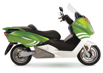
Vectrix electric maxi-scooter

Drayson Racing electric race car based on Lola chassis

Fisker Karma

UQM drive train for electric vehicles
Modal dialogs launched by a button
We often want to show some information or ask for data using a modal window. This custom element makes it easy to create such a thing.
<button-launched-modal id="example-modal"
                       title="Example Button-Launched Modal"
                       close-button-text="Inchide"
                       button-text="View example Modal"
                       additional-classes="modal-dialog-scrollable modal-dialog-centered">
<p>Cras mattis consectetur purus sit amet fermentum. Cras justo odio, dapibus ac facilisis in, egestas eget quam. Morbi leo risus, porta ac consectetur ac, vestibulum at eros.</p>
<p>Praesent commodo cursus magna, vel scelerisque nisl consectetur et. Vivamus sagittis lacus vel augue laoreet rutrum faucibus dolor auctor.</p>
<p>Aenean lacinia bibendum nulla sed consectetur. Praesent commodo cursus magna, vel scelerisque nisl consectetur et. Donec sed odio dui. Donec ullamcorper nulla non metus auctor fringilla.</p>
</button-launched-modal>
<button-launched-modal id="example-carousel-modal"
                       title="Example Button-Launched Modal with Carousel"
                       button-text="View example carousel modal"
                       additional-classes="modal-dialog-scrollable modal-dialog-centered">
<carousel-container id="carousel2">
    <carousel-item href="img/APTERA-8360-web.jpg" isactive="true"
        resize-width="700"
        captionbody="Aptera">
    </carousel-item>
    <carousel-item href="img/2009_green_bike.jpg"
        resize-width="700"
        captionbody="Vectrix electric maxi-scooter">
    </carousel-item>
    <carousel-item href="img/loladrayson-3-web.jpg"
        resize-width="700"
        captionbody="Drayson Racing electric race car based on Lola chassis">
    </carousel-item>
    <carousel-item href="img/karma18-web.jpg"
        resize-width="700"
        captionbody="Fisker Karma">
    </carousel-item>
    <carousel-item href="img/PP125.jpg"
        resize-width="700"
       captionbody="UQM drive train for electric vehicles">
    </carousel-item>
</carousel-container>
</button-launched-modal>
Cards
Bootstrap’s cards provide a flexible and extensible content container with multiple variants and options.
<card-block additional-classes="col" header="Vectrix electric maxi-scooter"
    body-header="Electric Scooter History"
    card-image-top="img/2009_green_bike.jpg"
    card-image-alt="Vectrix electric maxi-scooter"
    card-image-style="max-width: 400px;">
The Vectrix electric maxi-scooter was a highway-capable electric scooter launched in 2007.
</card-block>
Electric Scooter History
<card-quote header="Cute header text" body-header="Cute subtitle text"
    card-image-top="img/nikola-tesla.jpg"
    card-image-alt="Nikola Tesla"
    card-image-style="max-width: 400px;"
    quote-source="Nikola Tesla"
    quote-title="The Universal Mind">
Every living being is an engine geared to the wheelwork of the universe. Though seemingly affected only by its immediate surrounding, the sphere of external influence extends to infinite distance.
</card-quote>
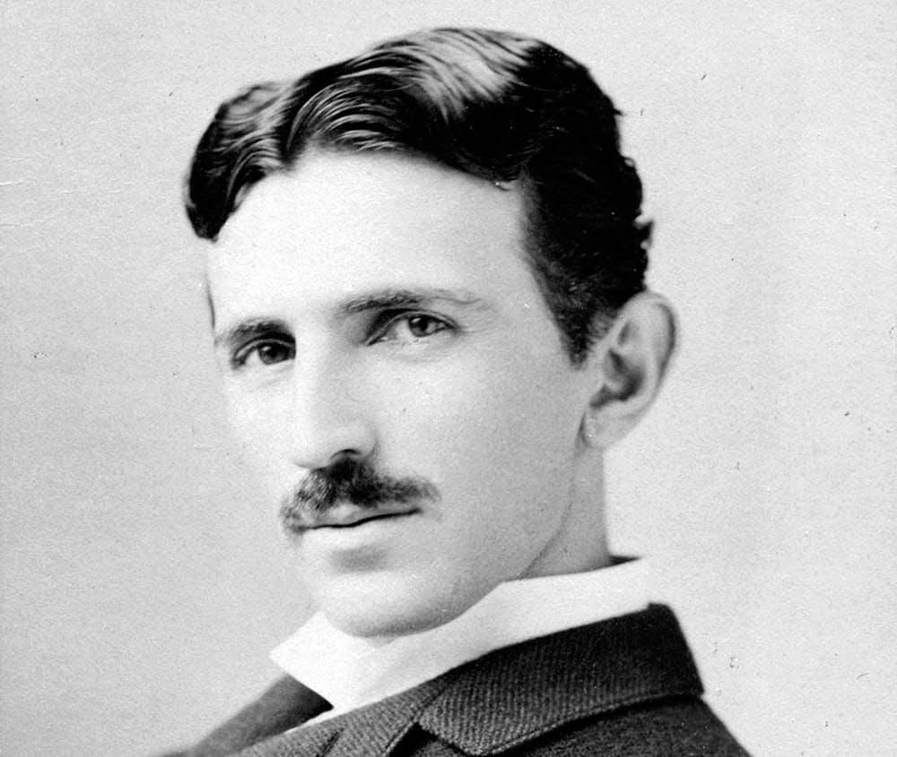
Every living being is an engine geared to the wheelwork of the universe. Though seemingly affected only by its immediate surrounding, the sphere of external influence extends to infinite distance.
Both types of cards optionally take these attributes
card-image-resize-to="pathname"Causes the image to be resized, and stored in the given pathname. The<img src="..">attribute is rewritten to use this pathname.card-image-resize-width="pixels"When resizing the image, it is resized to the given number of pixels width.
Bootstrap card groups, card decks, card columns
Any of these card types can be used within one of these containers:
<div class="card-group">
    <card-block ...>...</card-block>
    <card-quote ...>...</card-quote>
</div>

<div class="card-deck">
    <card-block ...>...</card-block>
    <card-quote ...>...</card-quote>
</div>

<div class="card-columns">
    <card-block ...>...</card-block>
    <card-quote ...>...</card-quote>
</div>
Dropdown menus
Bootstrap offers convenient dropdown menus that are very flexible. Here is an example using every option available
<dropdown-menu label="Example dropdown-menu" id="example-dropdown-menu">
<dropdown-menu-header label="Header text"/>
<dropdown-menu-item href="#" label="Item 1"/>
<dropdown-menu-item href="#" label="Item 2"/>
<dropdown-menu-button href="#" label="Item 3"/>
<dropdown-menu-divider/>
<p>Every living being is an engine geared to the wheelwork of the universe. Though seemingly affected only by its immediate surrounding, the sphere of external influence extends to infinite distance. -- Nikola Tesla</p>
</dropdown-menu>